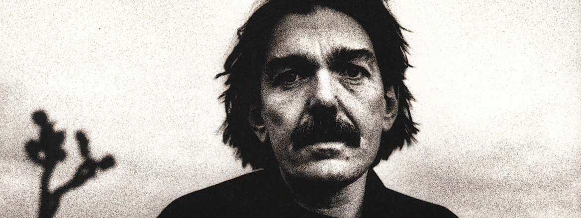
Don Van Vliet at Fred Hoffman Gallery
Fans from Don Van Vliet’s (a.k.a. Captain Beefheart’s) rock ‘n’ roll past will no doubt be curious to see what kind of paintings and drawings have resulted from Van Vliet’s last few years of working in these media. Given Captain Beefheart’s zany antics and his usually enigmatic, eclectic and sometimes provocative music, there could be no telling what he might come up with unless you hazarded a guess based on the cover art he has produced for his albums. Van Vliet still composes music, but painting and drawing capture his attention now and have since 1982, the year that marked his conversion into a visual artist. His 1885 debut was at the prestigious Mary Boone Gallery in New York, and sucessive exhibitions have followed both in California and internationally.
The question is, though, can Van Vliet paint? The answer, based on the current exhibtion at Fred Hoffman Gallery, is for the most part, no. With the exception of three paintings which are on the verge of discovering some significance about themselves, the remaining twelve are ill-formed, lacking in painterly craft and insensitive to the possibilities suggested by certain passages of their paint.
Van Vliet’s paintings share the general characteristics of an off-white background created either with heavily laid-down paint or raw canvas with added figurative forms, gestural linear tracings and straight-shot tube colors of cadmium red and yellow, Naples yellow, yellow ochre, alizarin crimson, bright green and, primarily, black. Van Vliet’s favorite mixed colors are a dirty moss green and yellow directly mixed with black. Figurative elements include monkeys, birds, Mr. Bill faces, fish, and trees that create a quirky landscape that mirrors Van Vliet’s interior world.
A lead painting in the show, Tint, Blush, Coo (1987-90), includes a large looming figure with a green triangle suggesting the figure’s shoulder and arm. More monkey-like than human, a hastily sketched-in face gazes out at the viewer over the triangle. An open mouthed bird is doodled to the figure’s left. Various other, black, gestural forms dominate the heavily impastoed white ground of the paintings. The marks, however, whether blocked-in or linear, do not relate enough to each other to create a whole. Instead, each formal element of the painting pulls apart but then has nowhere to go. There are no relationships created between the forms and there is no overall relationship to the rectangular shape of the canvas. The way the paint ends up on the canvas contributes to this instability. Rather than creating substance the marks, whether thick or thin, suggest only vagueness. They do not make the forms believable. Contextually, Van Vliet’s strange bestiary remains dumb, mute through lack of formal resolution. These forms do not speak.
The same situation holds true for other especially problematic paintings including Cinnamon Chops (1990), which allows no pictorial space for any interior forms; Day Barrette (1990), which confuses in its structure; Dust Devil (1989), which has such a disparity of paint application that the integrity of the work is physically compromised; and Aspirin Keeps Catfish Alive (1989), which sense cannot be gleaned from.
On the other hand, there are paintings that rise above this chaos of form and meaning. Boneless Spirit (1990) is the best of the show. All the elements common to Van Vliet’s work are present but now connected, in tension, to resolution, creating an understandable and merged image that communicates feeling. Yellow Scarab (1989-90) and Cross Poked a Shadow of a Crow #2 (1990), though different from one another in form, also have this capacity to engage. The first reduces Van Vliet’s visual vocabulary to virtual simplicity while the second again continues his pictorial vocabulary. Each are successful because they are resolved. They have what the others lack: adequate structure and subtlety of paint. These better works convince us of Van Vliet’s expression. The others because of their inability to relate the pictorial within them and, in turn, to balance the expressive qualities of Van Vliet’s imagined world, are botched efforts to reveal.
– Marcy Timberman, 1990